1) Donation page
This is first for a reason. One of the main goals of your site is to raise support. Even though other goals may exist as well - sharing your stories, illustrating your good work & impact, recruiting volunteers - the underlying goal is finding donors so your organization can do more. Your home page should have a "make a gift" button that goes directly to the giving form... not a general giving page or a why-to-give page - the form where gift amount and credit card info is entered.
Note: All samples have links you can click upon to view a larger version of the screen shot.
This is the donation page, which you go to directly after clicking on the link in the second image (the main ASPCA page).
2) Giving page
This is different from the page where you actually make the gift. Rather, this illustrates why your organization is worthy of support (which may tie into #3 & #5), different methods for giving, different areas for support, etc. You should also provide direct contact information for "gift support."
Example, Dartmouth: http://www.dartmouth.edu/~alfund/why_give/
3) Impact page
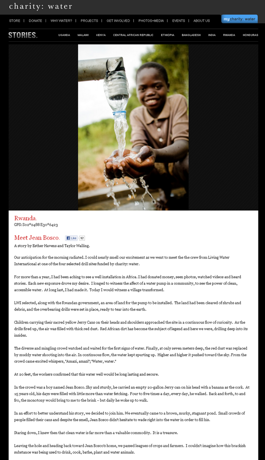
Illustrate the actual impact your organization is making, including testimonials (if appropriate) and pictures, videos, etc. of the good work you do. This is critical for current donors to see and to make future donors feel like they can make a difference by supporting you with time, talent or financial contributions.
Example, charity:water: http://www.charitywater.org/projects/fromthefield/index.php
4) Action page
Some people - particularly younger generations - are inclined to give their time rather than money. This is a great way to initiate the relationship between your organization and an individual. Is there a petition they should sign? Friends they should invite to join your community? An event to attend? Have a page that gives them an easy way to get involved.
Example, Red Nose Day: http://www.rednoseday.com/get-involved
5) Mission / Vision / Goals
This should go without saying, but you need to clearly illustrate why your organization exists, where you want it to go and what tangible goals you have in your sights.
Example, To Write Love On Her Arms: http://www.twloha.com/vision/
6) Social Media page
First, you should use icons for Facebook, Twitter, YouTube, Flickr, etc. and have them prominently located "above the fold" (visible without scrolling) on your page. Second, you can have a specific landing page with further details on your various social media profiles, campaigns and the people behind your social media efforts.
Example, WETA: http://www.weta.org/about/contact/socialmedia
7) Privacy Policy
In today's world, concern for privacy of data is high - and rightfully so. Therefore, a privacy policy is the helpful and responsible thing to post. As Nagy wrote: "It is important to have a privacy policy for your website even if you do not collect email address from your visitors. Privacy concerns include website analytics, such as google analytics and website cookies. Both analytics and cookies store certain amount of information about your visitors so the concern is real and for you to clear up this concern is a legal obligation to fulfill."
Example, Cookies for Kids Cancer: http://www.cookiesforkidscancer.org/terms_privacy.asp
8) Contact Us
This is a critical and somewhat obvious page, but I have regularly visited non-profit pages that have made contact information challenging to find. Additionally, provide multiple methods for contact. Email and phone are most critical, but it is also good to have various types of contacts - those for giving information/questions, those for the services you provide, any appropriate administrative contacts (HR, etc.). Include your business address and a map or directions, if applicable.
Example, Polaris Project: http://www.polarisproject.org/content/view/28/109/
9) About Us
This should sum up why you exist, what you hope to do and who is running the show.
Example, Michael J. Fox Foundation: http://www.michaeljfox.org/about.cfm
10) Frequently Asked Questions/FAQ/Q&A
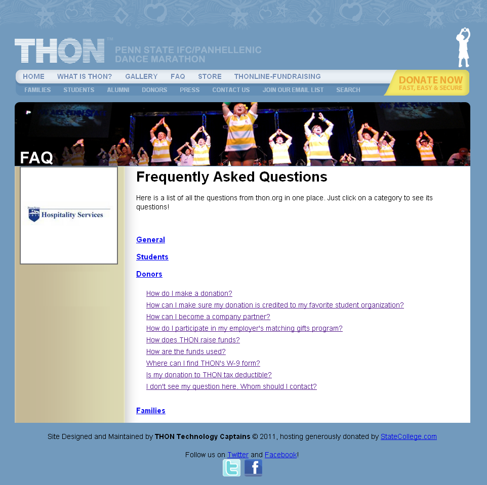
This is one of the most common pages on any website - for good reason. This can save you time by answering questions for your constituents before they reach out to you and your team.
Example, Penn State Dance Marathon: http://thon.org/faq
Bonus #11... optional-ish: Blog.
I think you should have a blog that can serve as the foundation for engaging donor stories, impact stories and help your social media's content development. Some don't have the time or expertise to maintain a blog... but I think these are just excuses. If you're a non-profit with any gumption, you have connected with content experts (employees, volunteers & friends). Having a blog and scheduling content can help get a misguided communications plan in line. Need help? Let me know. The reason I dub this "optional-ish" is because some non-profits simply aren't prepared to tackle a blog at this point. If you have bigger fish to fry, the blog can wait.
Example, Kiva: http://www.kiva.org/blog


14 comments:
Great ideas! Of course, all these pages can exist in a vacuum but the home page is where it all comes together... or doesn't!
Hello, thank you very much for this terrific post. While it is largely common sense, I find so many non profits don't really understand why it's important to have each of these pages, even if they are really simple. (actually preferably simple).
I encourage all my clients to use wordpress and change/update their content regularly even if it's just adding something small.
thanks again, I look forward to future posts. Deborah
Thanks indie schoolgirl & Deborah - I appreciate the feedback and comments! Completely agree that the home page is where it all comes together and - unfortunately - that these pages are forgotten all too often!
Hi all,
Lots of great feedback via email, Twitter, Facebook, LinkedIn, etc. on this post - thanks! A new series of threads is starting in the LinkedIn group inspired by this post - Non-Profit Website Best Practice Group (http://linkd.in/dzjas2). It will include weekly reviews of current nonprofit websites for best practice examples.
Thanks for posting this great article. it must be very much appreciated. thanks again.
linkbuilding software
Great post and I think these charity pages are a great tool to raise awareness and enhance education. Good cross section of pages thank for the post.
If your starting an ecommerce fulfillment services online. Then this is a must read. Yes, e-commerce are all about profit but its not a crime to help others. We should try to give out to others if we can afford it, charities is really a big part of our society.
I cannot add more. This list is complete with all the details that is needed for a fully functional charity website. Just to add, Wikipedia should have added a donation page a long time ago.
It also helps to incorporate some stock video clips so people will know and see what exactly they are helping for.
I agree great fulfillment services are a must for e-commerce. Non-profits can gain a lot from this with respect to charity.
Really good article :) - Thanks for the sharing :)
I generally agree.
We've done some non-profit websites that didn't have a donate page - they were more geared to phone call interactions, but I think that is the exception.
niece info obat keputihan gatal
jual crystal x di yogyakarta
penyebab komedo
jual obat keputihan crystal x
cara alami merawat rambut
cara mencegah kulit berminyak
apa itu keputiha
cara mengecilkan pori pori wajah
bagaimana menghilangkan komedo secara alami
makanan penyebab keputihan pada wanita
cara merawat kulit agar sehat secara alami
penyebab keputihan dan cara mengatasinya
cara efektif menurun berat badan secara alami
cara merawat bagian kewanitaan secara alami
cara mengatasi rambut rontok secara alami
Post a Comment